Analysing and sharing data to gain insights across a school group
GEMS Education
GEMS Education is one of the largest K-12 private education providers in the world, with leading international independent schools in six regions globally.
Founded in 1959, GEMS Education began in the UAE and now has 48 schools in that region alone, providing a quality education across multiple curricula including UK, Indian (CBSE and ICSE), IB and American.
A range of assessments are used across the group in the UAE to monitor attainment and progress, including GL Education’s Progress Test Series (PT Series) for UK curriculum schools, Measuring Academic Progress (MAP) for American and IB curriculum schools, and ASSET for Indian curriculum schools.
GL Education’s Cognitive Abilities Test (CAT4) is used throughout the group’s UAE schools to assess student ability and potential.
Key outcomes
-
Group-wide data analytics facilitate insights and decision-making at all levels
-
Visualisation tools provide easy-to use dashboards that display data for different audiences – maximising the benefits
-
In-school resource can be focused on putting the insights from the data into use, rather than data crunching
The challenges at group and school level
The challenge for GEMS at a group level was to find a method of tracking school and student data that would provide insights into relative school performance as fairly as possible, allowing for the different types of schools that they have within the group. Levelling the playing field across the different types of schools is a key driver in assessing school performance and being able to evaluate each in terms of their students’ progress.
At a school level, the priority was to show more detail from the data so that the senior team could better assess school-wide needs and teachers could easily see their class data to build up a picture of overall ability, identify underperforming students, see sub-groups for focus and help new teachers to immediately get a picture of their incoming class.
Hywel Benbow, Vice President: Global Data & Analytics, joined GEMS Education in 2017 with a remit to create a system that would answer the group’s needs as well as provide each individual school with the tools that would support them in getting the most out of the data.
Hywel tells us more: “When I joined GEMS three years ago, we began to initiate a new centralised system, creating dashboards of information that would provide consistency of reporting, regardless of curriculum or type of school.
I started by outlining a data vision, created after in-depth discussions with group colleagues and school leaders. I wanted to determine the key questions and decisions that leaders across our schools and the business needed to ask and make, at a strategic level and daily, weekly or monthly decisions.
I then identified what data was required – both internal and external.
We set in place group-level agreements with providers that allowed us to get the external data sent directly to the central team from GL Education, MAP and ASSET – rather than it going via the school. This saved a huge amount of in-school staff time, which was previously spent on manipulating the data themselves.
We combined this assessment data with our student data, which is held in a CRM system as ‘DNA sheets’ for each of the students in our UAE schools (around 125,000 students in total). This provides their demographic information including gender, date of joining, nationality etc. We use their unique student ID to match up these demographics with their attainment and ability data, and can then triangulate and analyse the results using Microsoft Power BI. This tool allows us to bring together all these sources of information and visualise the data in multiple ways via user-friendly dashboards.
With CAT4 being used by every school in the group, regardless of curriculum, a large volume of data is produced. We therefore use a system called Alteryx that allows us to bring together large datasets quite simply. We can then start to compare attainment against ability at both school and individual levels, to see where there are students who may not be performing at their potential.
We can then cut the data in lots of different ways using each of these data points.”
Hywel Benbow

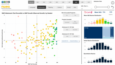
This dashboard triangulates student demographics with MAP testing results and CAT4 batteries.
Both allow you to drill down to student level to analyse attainment against ability across English, maths and science.
Each dot represents a student. The x axis shows their attainment, the y axis their progress and the colour their ability. Each visual is dynamic and interacts with other visuals to filter and cut data – allowing users to see a student’s performance across each subject.
GEMS data process
1. Collect and clean all required datasets:
-
- CAT4 data – processed through Alteryx (which allows you to work with multiple data sources and perform analytics)
- Other assessment data – supplied via Excel/CSV
- Student demographic data – taken from GEM’s CRM system Salesforce
- School data – taken from GEM’s Azure Warehouse
2. Using unique identifiers, match the datasets.
3. Inject data and build calculations within Microsoft Power BI.
4. Create visualisations to display data for different audiences.
5. Distribute and communicate the dashboards and reports to stakeholders.
Tell the data story.
GEMS data process
Using the data at group level
Hywel continues: “In the central office we look at the data at a higher, school level in order to compare performance and progress. Progress is the crucial area, as we want to be able to compare schools that have a wide variety of abilities – we wouldn’t expect them all to have the same performance level, but we would expect the progress to be similar.
We might want to look at how all our American curriculum schools are performing with higher ability students – or how our UK curriculum schools are helping students who have recently joined to catch up to expected levels in maths. We can do this via the benchmarking dashboards that show how our schools are performing against each other.
The senior teams within each school can also see the benchmarking dashboard data and review how their year groups are performing against other schools within the group. This is useful for a bit of healthy competition as well as sharing best practice.

Using the data at school level
Once the group dashboards were created, Hywel picked a selection of schools who were using different curricula, and worked with them to create and trial the school dashboards that they needed.
Hywel explains more: “Our questions for these trial schools were: What are your pain points, what are you struggling with, what do you need help with? From that we got a good understanding of the needs – and by visualising it on the dashboard, they were able to access the data much more easily.
We created student dashboards that allow schools to dig into the data on more of a granular level than the benchmarking view.
These dashboards can help schools answer questions such as ‘How are different classes performing?’ ‘How are subjects performing against each other?’ as well as allowing a student-level granularity that the classroom teachers can use.
The tools have been built to provide the data to different audiences – so we can ensure that we get maximum benefits within each schoolto inform teaching, learning and decision making.”

Supporting inspections
The dashboards, and the data within them, also support schools as they prepare for inspections.
Hywel explains: “In the UAE there’s a central School Inspection Framework that outlines the thresholds schools need to hit to be assessed as Outstanding, Very Good, Good and so on. We’ve built these into the dashboards, so that we can easily see where each of our schools sit against the framework.
Schools can also use the dashboards to report on how they’re looking at different groups of students within each cohort, such as EAL, lower ability and so on. I’ve seen some schools use the dashboards during the actual inspection to show how they analyse their data.”
The dashboards are also used centrally for quality assurance and self-evaluations.
Hywel explains: “A school might be saying, we’re really good at this aspect – and we can look at the data to see if this backs it up. We can look at what a school self-evaluates against what they actually get in their inspection – we want them to be 80% correct. So when the figure falls below this, we can start looking with the school at why this might be happening.”
Hywel Benbow
The impact on school time
Previously within the group’s UAE schools, each individual school had analysed their own data – which meant that there were some differences in methodology and also a lot of school resource being used. Now the centralisation of the data analysis means that they can focus on putting the data into use.
Hywel explains: “Previously the Data Manager within the school or the teachers with a data responsibility could have taken a couple of weeks to pull the data together, matching it up, trying to run some analysis on it.
Our aim is to take away the 80% of in-school time that was spent pulling data together and cleaning it, and flip it around so schools use 80% of the time to use the data to understand what’s going on. If you take that couple of weeks work away across all of our schools, then that’s a huge time saving.”
The school dashboards are shared with all teachers so that they can really support class-level teaching. Teachers have online access and are able to analyse it and then export the information for use offline if needed. Training and support is also provided.
Hywel explains: “We used to carry out site visits and would run through the dashboards with sets of teachers – but under Covid-19 restrictions we’re now doing more remotely. We also have brief training videos embedded in the dashboard that outline the key points and how to start manipulating the data.
The training sessions allow a two-way dialogue where schools might ask – can it do x or y? – and we can either demonstrate it or add it to our development list. Essentially even though the dashboards started as a group-level tool, we’ve now created and built the system for school leaders and teachers, so they can feed in their needs which can be beneficial to all schools across the group.”
Hywel Benbow
Applying these methods to other school groups
We asked Hywel to give his top tips to any school group considering this type of group-level analytics:
- Before you start, make sure that the data is of decent quality
- Have data standards across your schools
For example, at GEMS we insisted that all schools used the our standard student ID – not their SIMS ID or an internal one – to ensure that we could be confident of matching the data with the student. - Allocate someone at a senior level to hold responsibility for the data and programme
This will facilitate the introduction of the programme. - Set up data sharing agreements
Set up agreements with external providers and ensure that data from multiple schools is supplied in single, consistent files. - Use dashboards to improve the presentation and analytics of your data
The volume of data that schools can produce continues to grow, making it harder and harder for a user to grab a key message. That’s where data visualisation comes in, summarising and presenting large data sets in simple and easy to understand visualisations, to give readers insightful information.
He concludes: “Setting this kind of system in place, as long as you have decent data and data standards and knowledge of Power BI and data modelling, it shouldn’t be too large a task. And you can pick up the Power BI knowledge through free training online.”