Matthew Corke from Wellington College in Shanghai shares how he has been using Power BI to visualise the data generated from CAT4:
CAT4 (Cognitive Abilities Test) is a baseline assessment provided by GL Education that many schools use to get an idea about the ability of each student. The assessment is comprised of three 45-minute multiple-choice tests that assess pupils in their verbal, quantitative, spatial and non-verbal abilities. The results from these tests help teachers to identify the high-flyers, those who might need additional support, biases towards either spatial or verbal thinking and those with a verbal or quantitative deficit/surfeit.
Taken together, this data can help support teachers in differentiating their lesson delivery appropriately, in identifying underachievement, rewarding success, assessing requirements for SEN or EAL support and setting aspirational attainment targets.
The challenge, as always, is making this data available in a manner that makes interpretation and analysis easy for the end-user. By adding the data to our Power BI model, we can now connect it with attainment and assessment data to facilitate better analysis.
The page below shows the CAT4 scores for the selected group of pupils in each of the four batteries as well as the overall score. Each dot is a pupil and the y-axis shows the CAT4 score. The average score is shown by the horizontal dotted line across each chart and below it. The scores (technically known as the Standard Age Score or SAS) are on a normal distribution with a mean SAS of 100. Pupils with a score above 126 are in the top 4%, whereas between 90-110 is considered average ability.
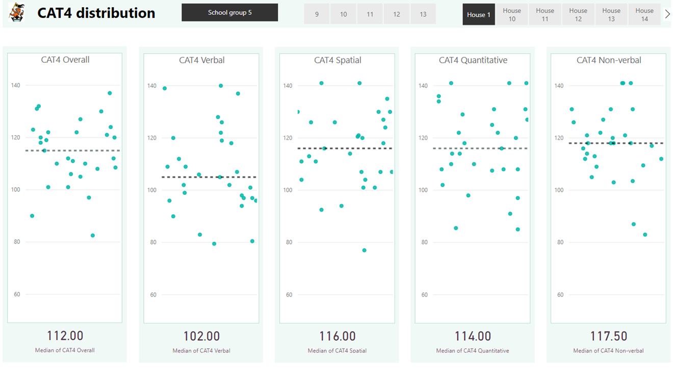
The distribution of CAT4 scores for each battery.
In our school, as well as many other international schools, pupils have a lower verbal score compared to the other batteries. Many pupils are bi- or even tri-lingual and English might not be their first language. Knowing the extent of this deficit within specific student groups highlights the need to incorporate strategies to improve literacy in our lessons.
The CAT4 profiles page is used to help understand the variation in scores in more depth. The chart on the left of the page below shows whether pupils have a spatial or verbal bias and thus can inform the teaching approaches used. Those with a spatial bias are more likely to benefit from strategies including greater use of images, flowcharts, diagrams and model making whereas those with a verbal bias will benefit from discussion, debate, as well as reading and writing activities.
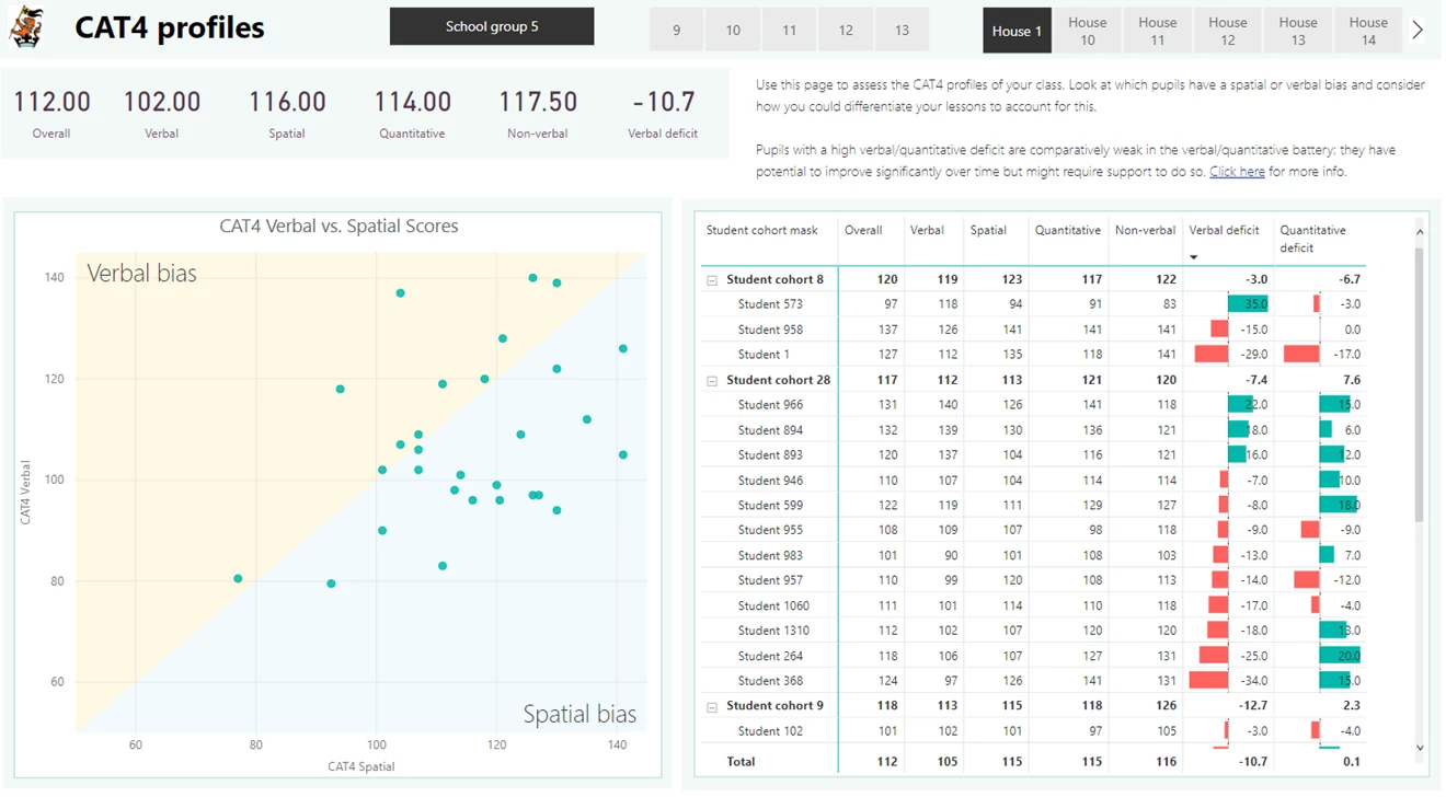
The CAT4 profiles page highlights whether pupils have a verbal or spatial bias and the degree to which they have a verbal or quantitative deficit.
Another valuable measure is the verbal deficit (the verbal score minus the non-verbal score). The non-verbal battery is most like a normal IQ test and measures a pupil's innate ability, whilst the verbal score might change as a pupils grasp of English improves over time. Therefore, a pupil with a significant verbal deficit is likely to have a lot of potential if they are given ample opportunity to develop their use of English.
The quantitative deficit is the quantitative SAS minus the spatial SAS. The spatial score indicates the innate ability whilst the quantitative score is more likely to change with time. Thus, a high quantitative deficit indicates the potential for a pupil to improve over time in mathematics and sciences especially.
These measures are both shown in the pivot table (see the detailed view below). Applying conditional formatting using the data bars for these columns makes interpreting the data quick and easy.
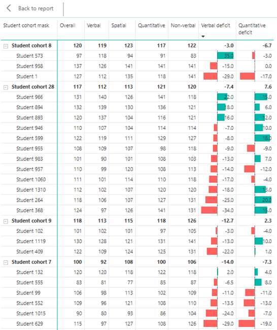
A pivot table to show verbal and quantitative surfeit or deficit organised by student cohort.
The final page (below) is used to analyse CAT4 data alongside the report attainment grades for each pupil. A slicer has been placed (with horizontal orientation) above the charts and pivot table so that a user can select the most applicable CAT4 battery for their subject. For example, verbal scores appear to have the strongest correlation with attainment in geography whilst the quantitative score is most applicable in mathematics.
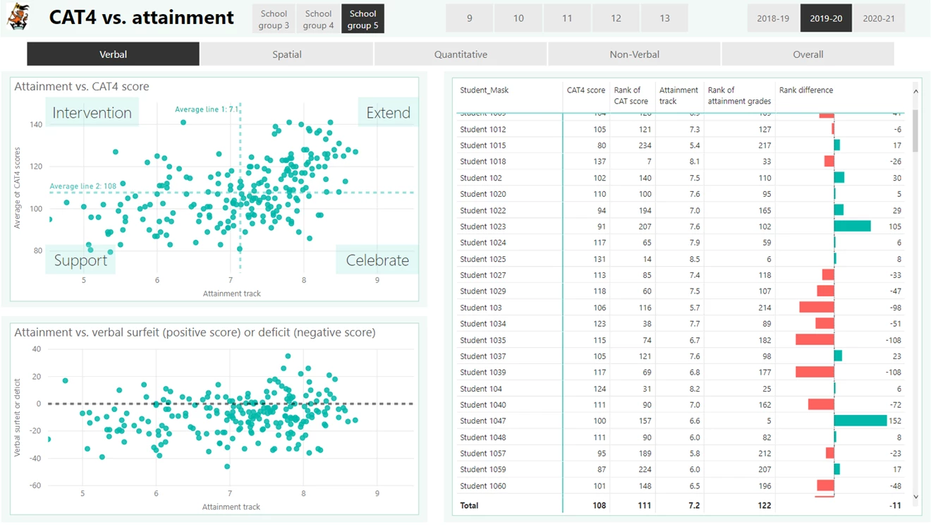
The CAT4 analysis page is used to compare CAT4 scores with our attainment data to identify those who might be performing better than we might expect, those who could be underachieving as well as the more and less able.
Having selected the most relevant battery, the top scatter chart helps to identify the pupils who might be underachieving (high CAT4 score and low attainment grade), those who are working hard to achieve highly (low CAT4 score and high attainment grade) as well as those who are more and less able.
The CAT rank minus attainment rank measure illustrates the same idea in the pivot table. If a pupil has the highest CAT4 score in the selected group of pupils, we could assume they should also have a high attainment grade. Therefore, the difference between these ranks will be small – i.e. their reported attainment is what we might expect based on their CAT score. However, if the CAT4 rank is low and the attainment is high we will get a positive difference between the ranks. This might indicate that the pupil is doing better than expected and putting lots of effort into their work. Finally, if the CAT4 rank is high and attainment is low we get a negative difference, indicating potential underachievement.
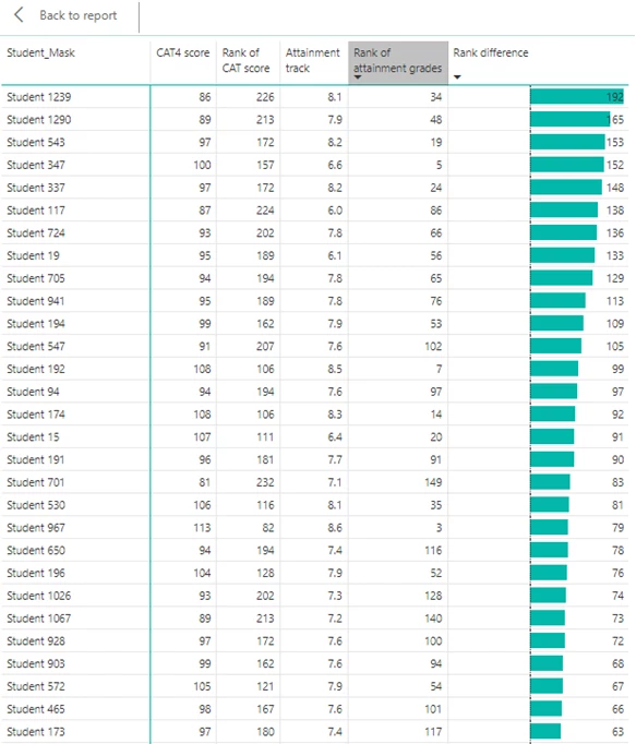
The CAT4 rank minus attainment rank in more detail. In this image, the rank has been ordered to show those who are doing better than we might expect. In this case, we should be celebrating and rewarding their efforts.
Being able to access this insight easily enables the right questions to be asked and strategies implemented to help pupils improve. For some pupils, a verbal deficit might be a barrier to their progress in which case I’d want to know how those pupils were being supported. Those ‘underachievers’ might need to be held to higher expectations or perhaps there are pastoral issues ongoing. For our high fliers, we need to know if they are being sufficiently challenged whilst additional support should be in place for the lower ability pupils. Finally, are we celebrating the success of those pupils who seemingly put in huge amounts of effort to achieve highly?
It’s important to note that this data is the starting point rather than the answer. With an understanding of the ability profiles of each pupil, we can differentiate our lesson delivery appropriately as well as using the data to ask informed questions about the progress pupils are making.
About the author
You can read more of Matthew's blogs, including a discussion of sharing data with students and how to superpower your attendance data on his site.
Matthew began his data journey with a vision that he could tie all the data the school had about their students to enable better analysis. His initial forays into producing a data app were with Qliksense, but he switched to Power BI once it became available in China.
He says that he's learnt huge amounts during a process of trial and error and his blog is an attempt to share some of those lessons and to help others use data more effectively, leading to better outcomes for all students.